Music and art have both been around since the day of our Paleolithic ancestors, so it’s no surprise that there have been plenty of crossovers in the two worlds. From album artwork, music videos, performances, to painting-to-art. The two have a lot that they can do for one another, and when done properly, the results are fantastic.
One of the greatest legacies of art and music working together are The Velvet Underground. Lou Reed and John Cale had been working together since 1964, with The Velvet Underground forming both its name and lineup by ’65 and getting a few regular gig jobs, it wasn’t until ’66 that they really took off and would leave the legacy of being one of the most important bands of all time. This happened through a chance meeting with Andy Warhol. Andy Warhol met the Velvet Underground in 1965 through the filmmaker Barbara Rubin. This is when Andy Warhol took over as their manager, and introduced Nico Paffgen to feature on some of the tracks, and form the album The Velvet Underground and Nico. During this time, Warhol started what could be called their first tour, or a live art show; he originally called it Erupting Plastic Inevitable, later to be called Exploding Plastic Inevitable. The Exploding Plastic Inevitable would be compromised of The Velvet Underground and projected videos and posters by Andy Warhol, this could either be considered an example of installation art or of a tour.
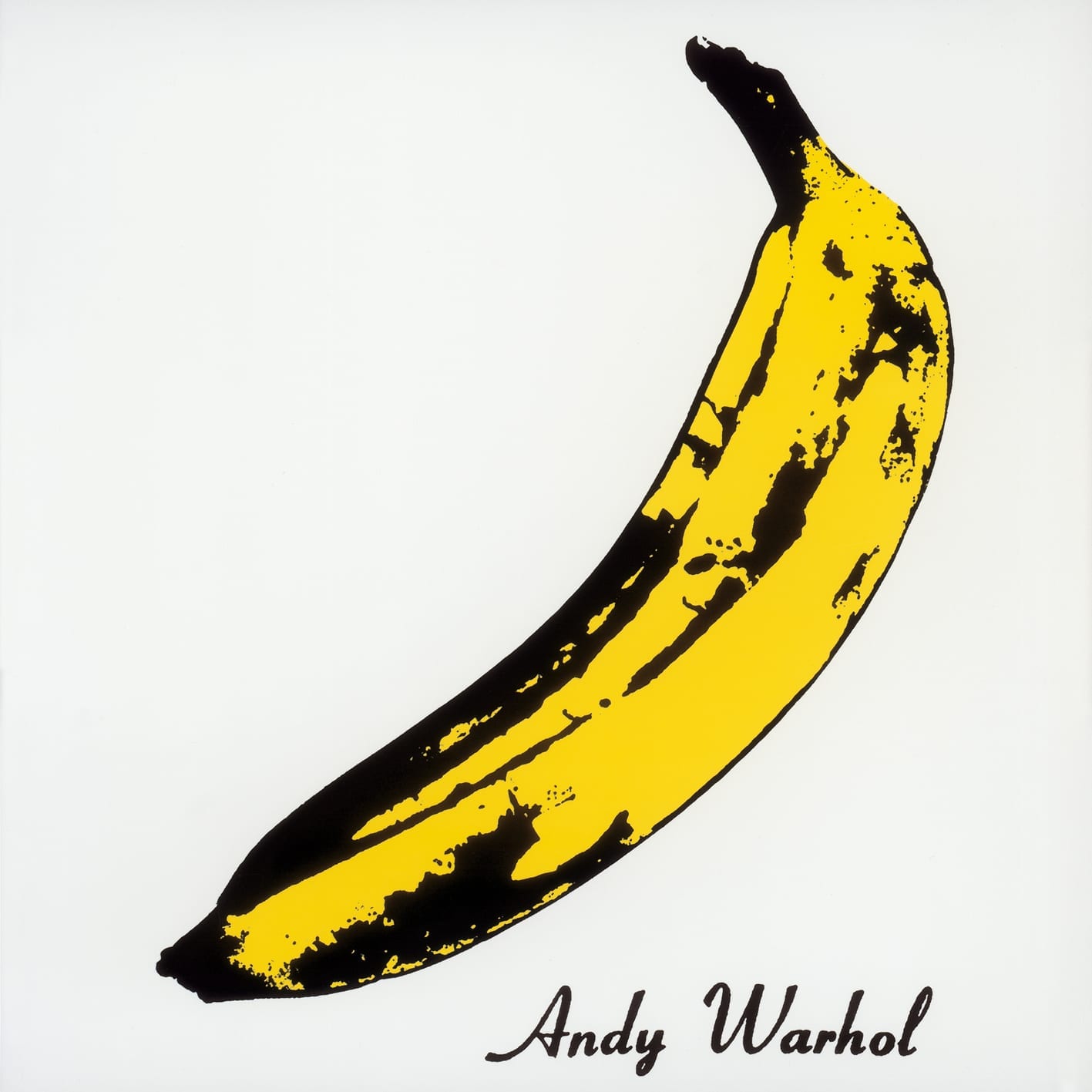
As well as managing the band for a while, Andy Warhol designed one of the most famous album covers of all time, The Velvet Underground and Nico. The album artwork features one of the best examples of American Pop Art, an illustrative-like, bright yellow banana. The original artwork would have been a yellow banana sticker in which the skin could be peeled off to reveal a pink tone banana underneath. The production of this was complicated and eventually became just the yellow banana print. With or without the sticker this album remains one of the most important albums both in music and art of all time.
It’s not uncommon for a lot of bands to have had met at art school. One of, if not the most famous examples of a band having its origins in art school are The Beatles. Though John Lennon studied at the Liverpool College of Art, it was actually Paul McCartney that did an ink drawing that would become the blueprints for the Sgt. Pepper’s Lonely Hearts Club Band album. With the ink drawing as a blueprint, British Pop Artist Peter Blake and American Pop Artist Jann Haworth designed the cover, while Michael Cooper was in charge of photography and Robert Fraser was the art director. The album features the four Beatles and another 70ish famous figures. The result is a bright, playful, and witty album cover (much like British Pop Art). This cover even won Blake and Haworth the 1968 Grammy Award For Best Album Cover, and it’s not really a surprise why it did so. To this day the album artwork is one of the most recognisable albums.
One of today’s arguably most important living artists is Gerhard Richter who not only developed his own style of painting he refers to as ‘the blur’ but has also mastered photo realism painting, amongst other things. Keeping these things in mind, it is no surprise that also arguably one of the greatest rock bands of all time, Sonic Youth decided to use Richter’s photo realist paintings – Candle – for the album artwork to Daydream Nation, and another similar painting is featured on the back of the album. The painting was part of a series that Richter had done, looking at the tradition of still life and memento mori paintings. The paintings themselves are very beautiful, somber things, a sharp but somehow fitting contrast to Sonic Youth’s Daydream Nation.
To anyone that has ever read Just Kids by Patti Smith, it would come as no surprise that Robert Mapplethorpe the photographer is the brains behind Smith’s album Horses. The photograph is of Smith standing against a white wall, in a pose she describes as ‘somewhere in between Charles Baudelaire and Frank Sinatra’. The photograph was taken in a Greenwich Village apartment using natural light, this natural light produced the faint triangle against the wall. The photograph is black and white, and Smith is dressed in her signature androgynous style, all of this amounts to a fantastic, powerful album artwork that will always stand out in a collection.
There are countless of artists that have provided their work, or created work for album art, music videos etc. Marina Abramovic, one of two artist’s to make it to Time’s 100 Most Influential People of 2014 participated in a section of Jay-Z’s Picasso Baby, as well as working with Lady Gaga. This goes to show that artists don’t only use creative input in album artwork.
Music and visual art when merged together truly produce some absolutely wonderful things, that make the experience of one or the other that much better.
Words by Selene Mortimore
